McHALE DESIGN CASE STUDY: MONSTERVERSE- THE LEGEND CONTINUES…
by McHale Design | 12 Sep 2024
General

McHALE DESIGN CASE STUDY: MONSTERVERSE- THE LEGEND CONTINUES…
McHale Design’s Collaboration with Playmates Toys for Godzilla x Kong: The New Empire
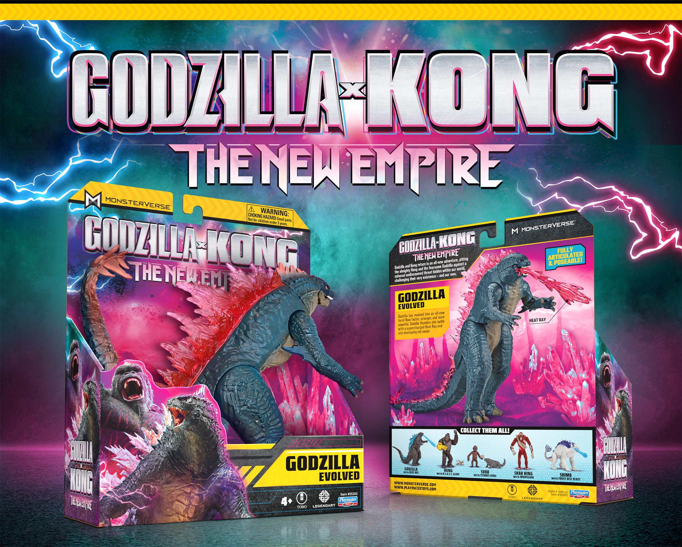
McHale Design and Playmates Toys reunite to bring the latest blockbuster in the Monsterverse franchise, Godzilla x Kong: The New Empire, to the toy aisle. With new characters and monsters emerging in the Monsterverse, we were tasked with updating the branding and packaging to follow suit. The results evoke epic storytelling through larger-than-life characters, dynamic graphics and a vivid new backdrop color of… pink! Really? But more of that in a moment…
THE CHALLENGE: CRAFTING A TIMELESS MONSTERVERSE BRAND
Unifying Decades of Legendary Monster Movies with a Cohesive Branding Strategy
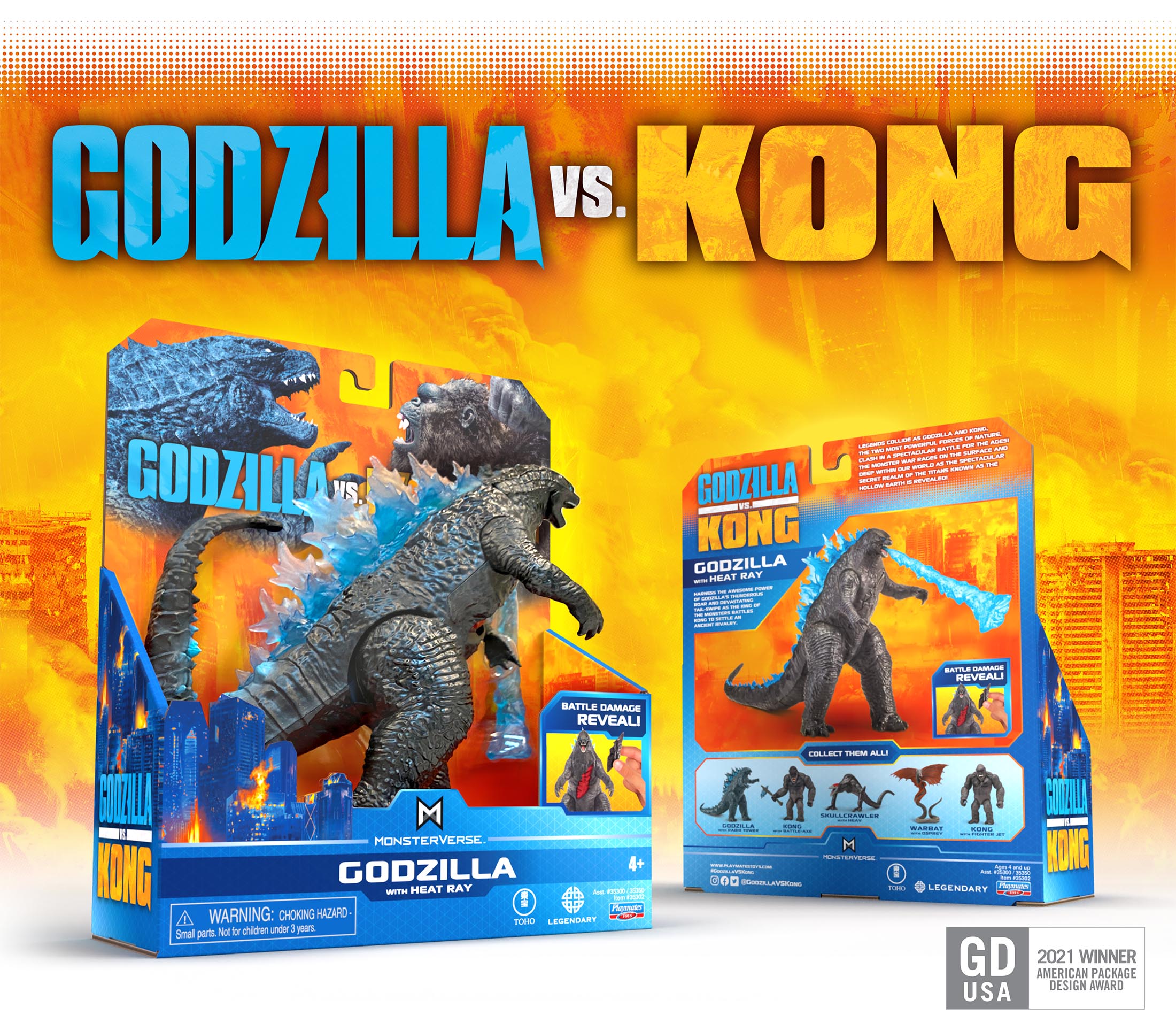
The journey began in 2021 with the creation of a Monsterverse brand for the upcoming movie Godzilla vs Kong. In addition to the new movie, the branding needed to work with the entire history of the Godzilla monster movies, decades of a legendary movie franchise beginning with the original black and white Toho version. Our challenge was to unite the Monsterverse empire in an identifiable, cohesive branding statement that considered the era, style, and personality of the entire genre.
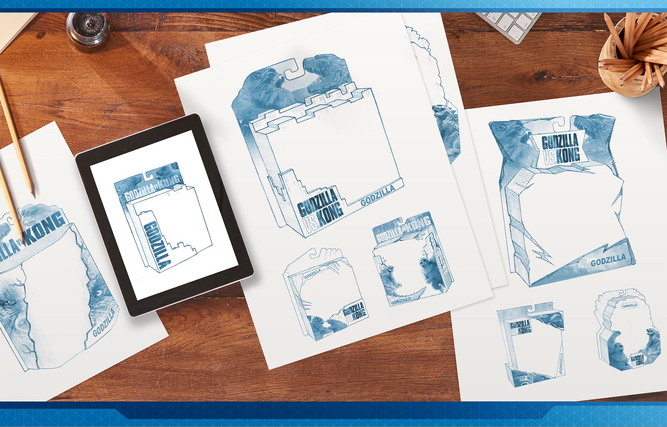
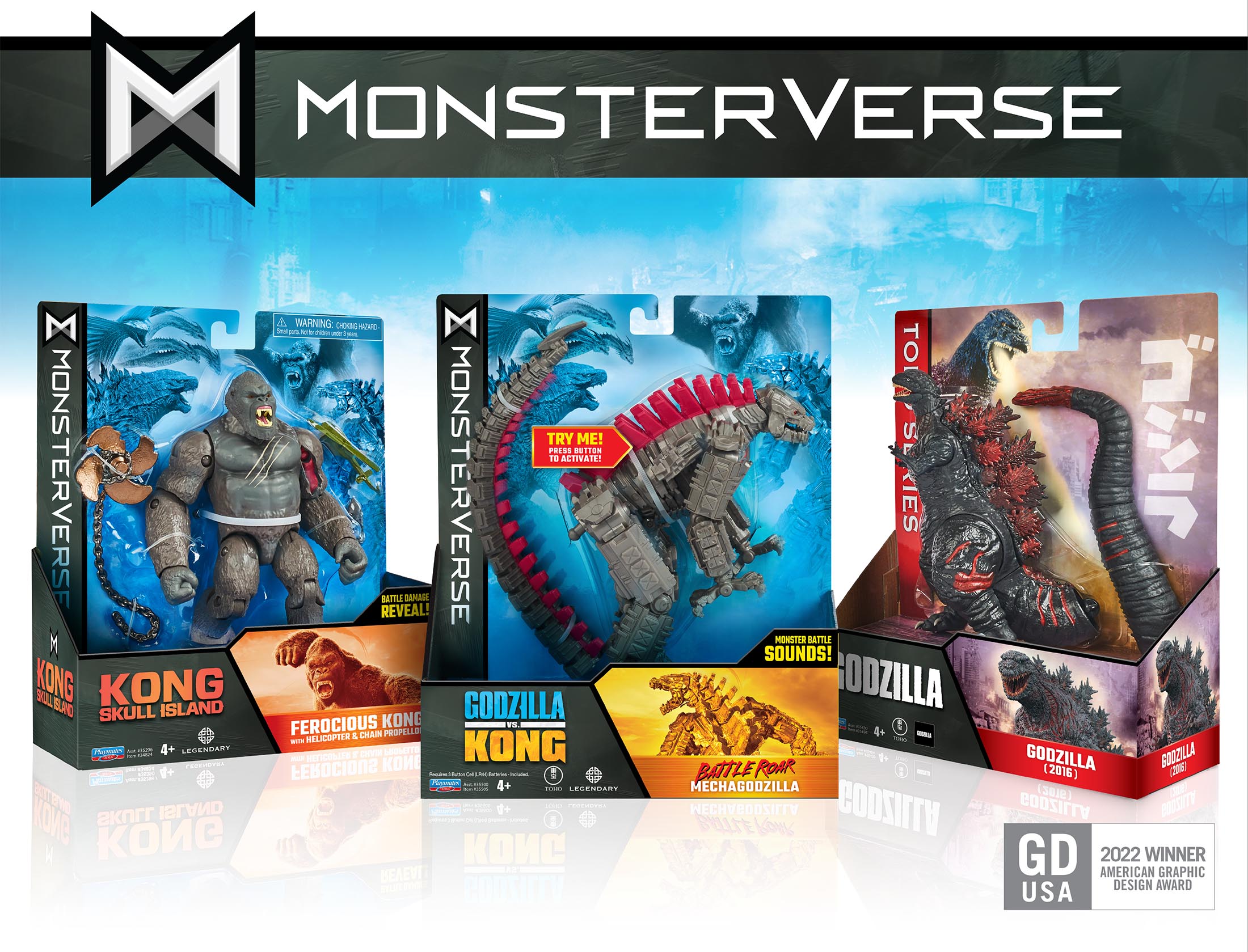
THE BRANDING STRATEGY: BUILDING A MONSTERVERSE EMPIRE
Architectural Framework and Visual Hierarchy as the Backbone of the Monsterverse Identity
Branding can be approached in many ways—Coca-Cola is branded with red, Batman has his signal, and Nike has the famous swoosh. For Monsterverse, we landed on brand architecture as the unifying feature, with an organized hierarchy across a wide range of visual styles across many decades of content. Strong geometric holding frames, consistent placement of graphics and logos, and an identifiable eco-friendly packaging structure were successful in creating a powerful architectural framework, while the large back panels featured unique movie scenes, character art, and color palettes. These elements provided clear segmentation and storytelling for each era of content.
THE IMPACT: A MONSTER-SIZED AISLE DISRUPTER
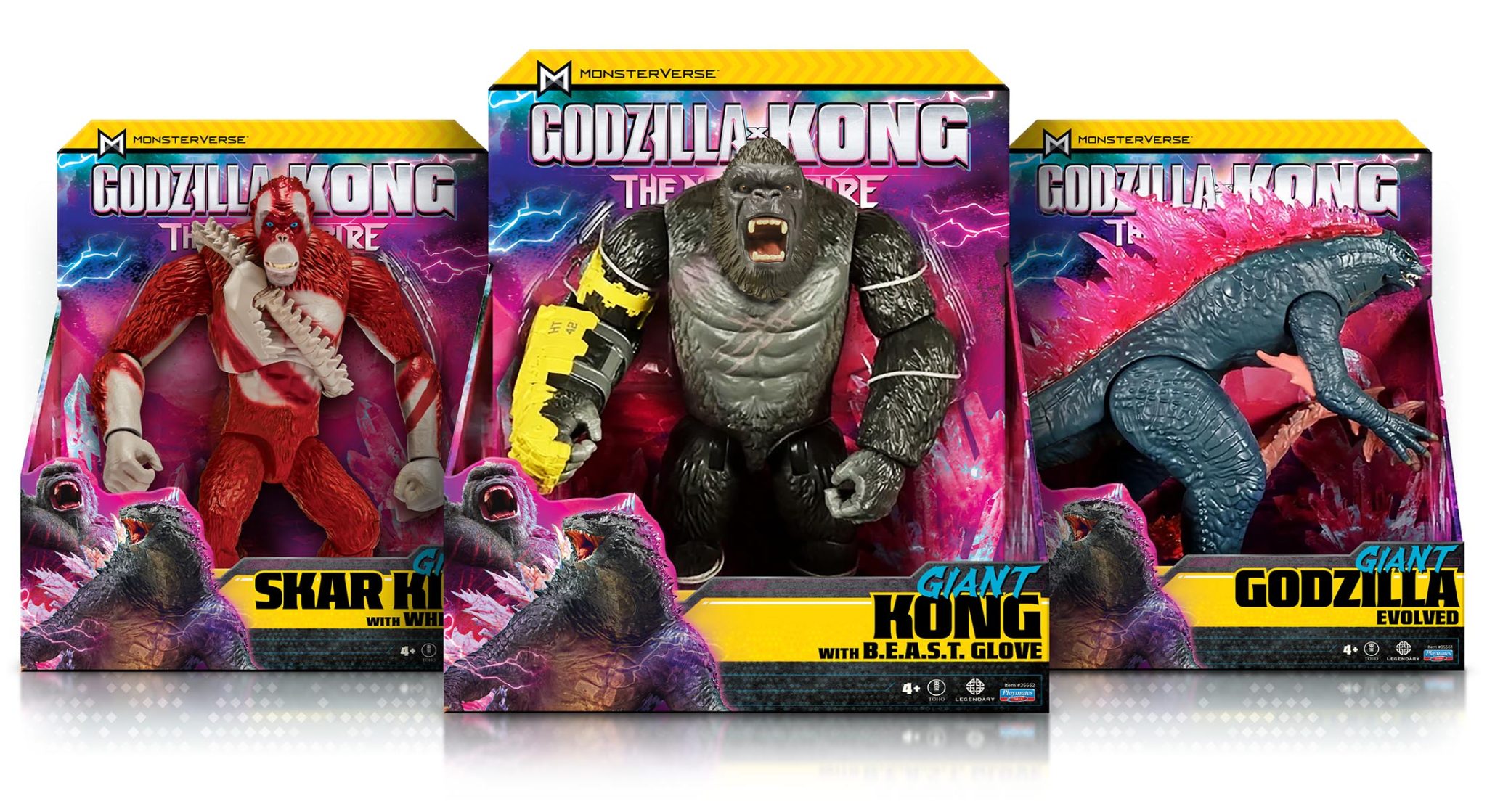
Pink in the Boys’ Aisle: Bold Color Choices That Make a Statement
When we were approached for our latest update in the series, we were asked to draw from the same source that inspired the new film, 80’s Heavy Metal posters. These featured strong hints of pink and purple hues. With Y2K color palettes trending and the success of the Barbie movie, pink seemed to be everywhere, except in the boy’s aisle. If you are going to introduce pink to a line of terrifying titans, you better bring it big! The richly saturated magenta colors are a monster-sized aisle disrupter, creating a bright background for the earth-toned product to jump off the shelf! Combined with the yellow caution tape striping, and aggressive character art, the branding retains a masculine appeal that is energized with the infusion of pink.
With a bold new color, strong branding architecture, and dynamic graphics, the updated packaging and branding captures the essence of Godzilla x Kong, igniting imaginations and thrilling fans by spilling the film experience into the toy aisle! This resulted in the Godzilla x Kong toy line becoming a top-selling action figure in the U.S., even before the film’s release. Which was a monster feat indeed!

Recent Blogs

The Bloom Report
The Smart Way Toy Brands Are Finding Retailers Between Trade Shows

The Bloom Report
Asmodee's Julien Sharp: Where Is Board Gaming Headed Next?
Press Release
Small businesses cannot keep absorbing this.

Press Release
A Game Studio Launches Proof-of-Play™ Publishing Initiative
Reviews
Film Review: Toy Story 5
See more
Recent Wiki
BOOK REVIEWS
Film Review: Toy Story 5
BOOK REVIEWS
Film Review: Free to Play
PEOPLE
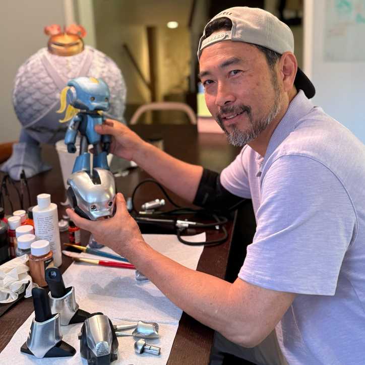
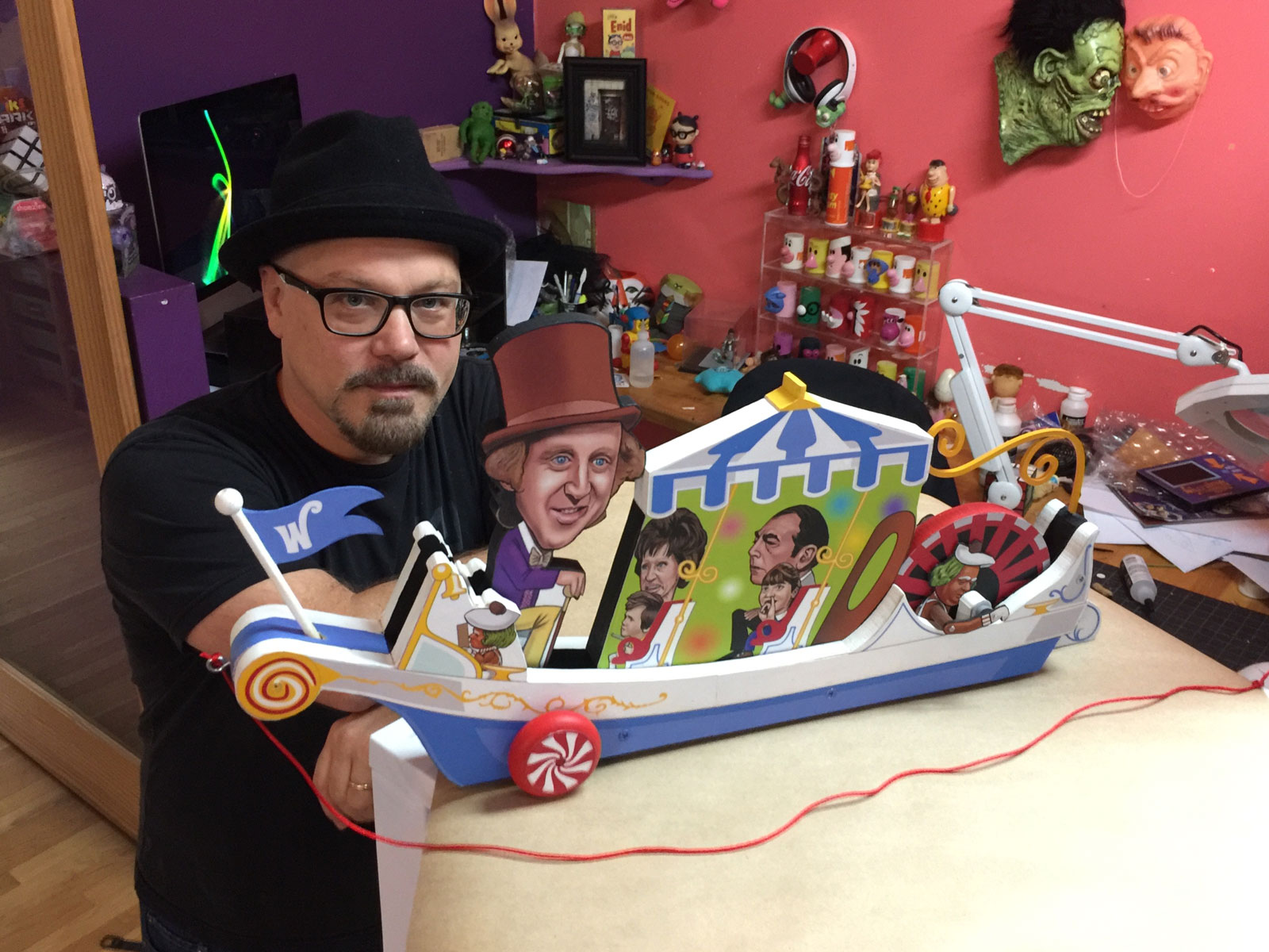
Howard “Quiggly” Chang Talks Designing Teenage Mutant Ninja Turtles Toys, Ancientz and more!
COMPANIES
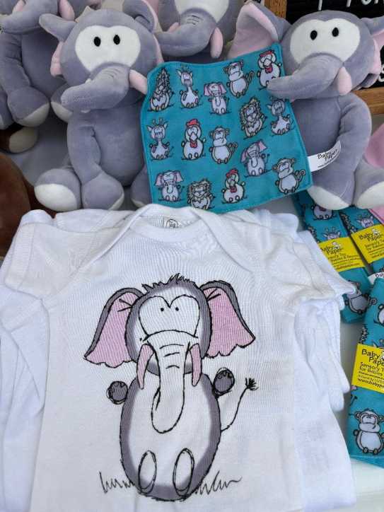
Two Small Businesses, One Big Leap of Faith: Baby Paper and Paper Cow Join Forces on a New Collaboration
MISCELLANEOUS
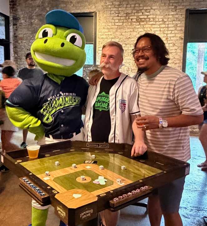
Former LEGO Master Designer Launches Unplugged Arcade
See more
POP's Got Talent

POP Entertainment
Randy Klimpert Shares his Ukulele Collection
POP Entertainment
Steve Casino Peanut Art
POP Entertainment
Everyone's Talking about POP!
POP Entertainment
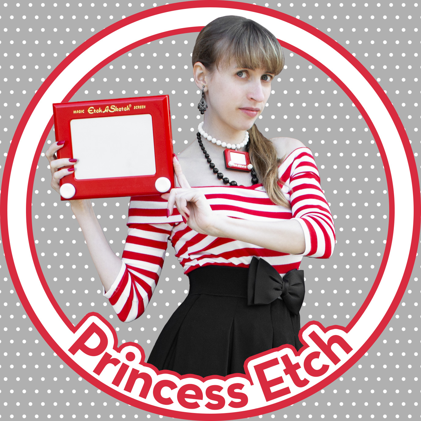
Princess Etch - a Multi-Talented Etch A Sketch Artist

POP Entertainment
Joseph Herscher of Joseph' s Machines.
See more
Recent POPcast

Hidden Role: The Brains Behind your Favorite Games
Brent Bushnell talks Two Bit Circus, VR, & STEAM (Part 1)
Hidden Role: The Brains Behind your Favorite Games
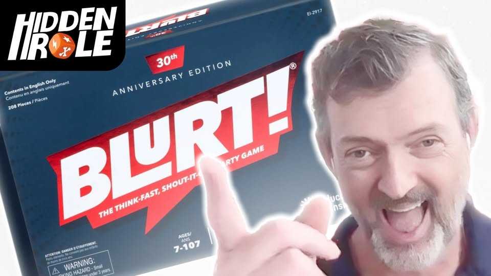
Tim Walsh Celebrates the 30th Anniversary of Blurt!
Hidden Role: The Brains Behind your Favorite Games
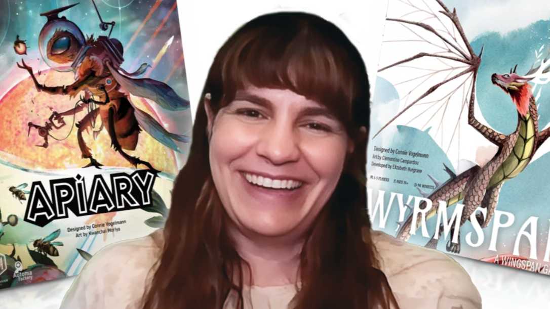
Connie Vogelmann designed Apiary & Wyrmspan!
Hidden Role: The Brains Behind your Favorite Games
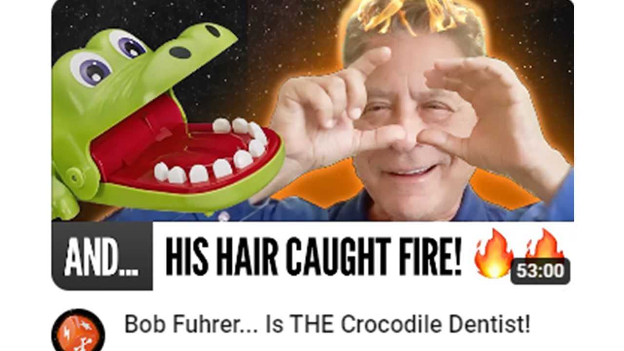
Bob Fuhrer... Is THE Crocodile Dentist!

Hidden Role: The Brains Behind your Favorite Games
Tom Dusenberry... Bought Atari, Wizards of the Coast, and Avalon Hill!
See more
POPDuos

POPDuos: Interviews with Legends and Leaders
POPDuo: Richard Dickson, Mattel’s President & COO, and Kedar Narayan, Young Inventor Challenge AMB

POPDuos: Interviews with Legends and Leaders
POPDuo: Will Shortz and Josh Wardle

POPDuos: Legends and Leaders Explore Creativity
POP Duo: Elan Lee, Co-Founder, Exploding Kittens.and Jeff Probst, Host and Exec Producer, Survivor

POPDuos: Legends and Leaders Explore Creativity
POP Duo: David Fuhrer, MNG Director, Blue Sq Innovations & Shawn Green, past Dodgers & Mets MLB Star

POPDuos: Legends and Leaders Explore Creativity
POP Duo: Bob Fuhrer, Founder, Nextoy and Tom Fazio, Golf Course Designer
See more
Featured Articles
The Bloom Report
Toy Inventors--The Heart and Soul of the Industry
The Bloom Report
Brian Turtle: 'Endless' Stories, Advice, Kevin Bacon and More! tBR Person of the Week
Biographies and Interviews
Jonathan Levy on Jon2.0 - from Co-Founding Mastermind Toys to Spin Master
Biographies and Interviews
Andrew Perlmutter's Journey from Glencoe to Funko with Crazy Ideas that turned out Golden
See more