ArtWorkPlay with Kenny K: "Splash Out" (Far Out Toys)
by Kenny Kiernan | 29 Jun 2021
Industry Commentary, Op-Ed
Creating illustrations, characters and packaging for the toy industry and loving it! ArtWorkPlay with Kenny K is about sharing insights, WIP pics and anecdotes with collaborators from past projects in order to de-mystify the process a bit, and shed some light on how it's done!
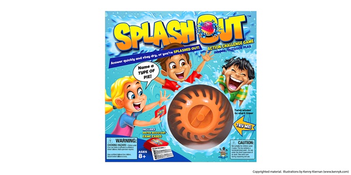
Splash Out™
The project: "Splash Out" packaging illustrations
Client: Far Out Toys
My guests and co-conspirators: Paul Fish and Barry M. Chung
KK: Thanks so much for contributing here guys, Splash Out was really fun to do! Can you describe how this project came together?
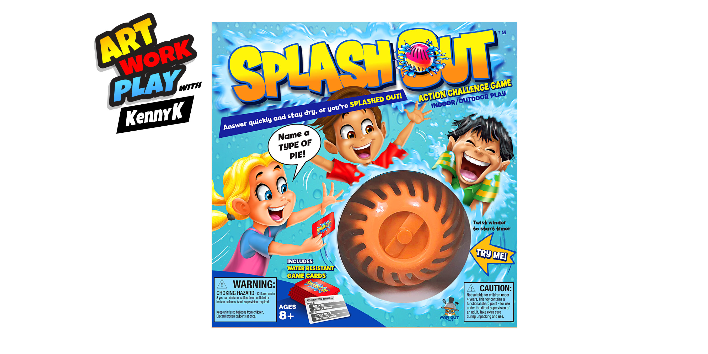
BC: I first got a call from Keith Meggs and Paul, both toy industry veterans, who started a new toy company called Far Out Toys. I worked with them at other toy companies and was hired to create and art direct packaging design for their first product out of the gate called Splash Out, a water play toy/game.
During the initial packaging design stage it was determined we wanted to use illustration incorporated around a cutout in the package to allow for a “Try Me” feature. After getting approval on my design layouts, Paul asked me to contact Kenny, whose illustration work he admired and would have the right tone and style.
PF: Barry did a great job on the layout, color scheme and communication, and his first pass on the artwork was in line with the direction I’d requested and the examples of successful games from retail that I provided. However, the feedback from some retailers was that they wanted us to take a different direction. While at the Splash Out inventor’s (Rudell Design) studio, I saw some work that Kenny was doing for another product on its way to market. The style really captured fun and manic tone we were looking for, so I asked Elliot Rudell for Kenny’s contact info, and I connected him to Barry.
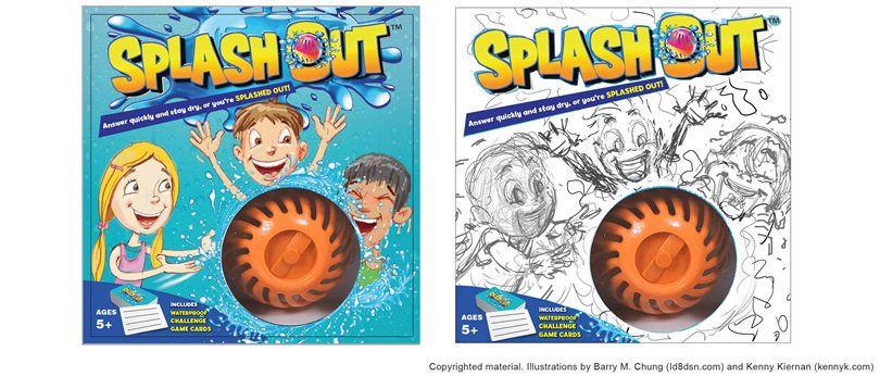
KK: Barry provided me with a great new color sketch (above, left) and had already designed the logo. That water drop pattern in the background and teal color were already established. So with those parameters already set, at that point the art direction for the illustration work was to just play up the motion and splashing action of the game, and really make it look like the kids were laughing and having a lot of fun.
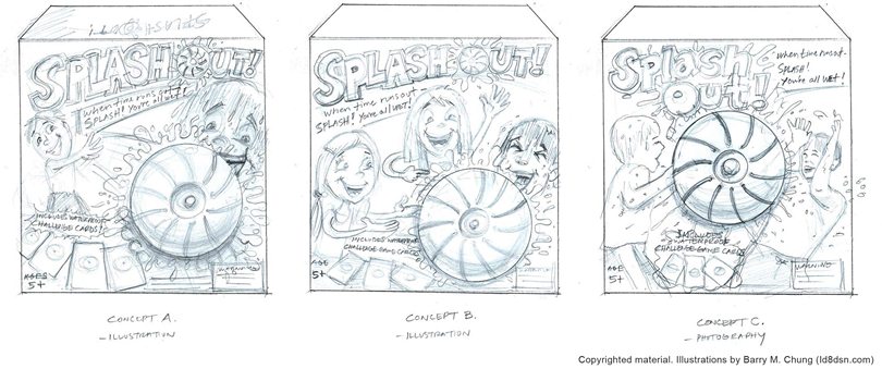
I did my usual thing which is to start with really rough scribbly sketches as you can see in the above pic; at this point just fitting the big shapes the best way into the shot, working around whatever elements are already fixed on the page. Here I'm trying to maximize the use of the available space and draw as much attention I can to the fun facial expressions of the three kids, their body language, and splashing action.
From an illustration standpoint, getting that initial layout is crucial. If it's just scribbly roughed-in figures, but still "reads" effectively at a glance within the given layout, then that's a good foundation to work from, and I'm already halfway there! From then on it's just embellishing over this.
The next step is tightening up the sketches so they look presentable and other people can understand what's going on! I tightened up the boy and girl on the left -
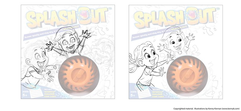
... then did the boy getting splashed at right and added the water splashes.
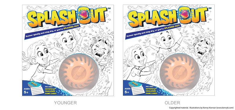
Word came back was the kids were too young; the toy is aimed at an older age group so I aged them up a bit by giving them a smaller head in proportion to the body, and longer arms - a simple solution, but very effective!
PF: You can see even at this stage that package brings the product to life. The kids are having a blast and water is flying everywhere. It all really works well with Barry’s logo, field and colors
BC: Kenny was a pleasure to work with! From my color sketch packaging layout he was able to put his stylized spin on it. With minimal art direction and revisions he brought the fun, excitement, and “wetness” to life in his great illustration.
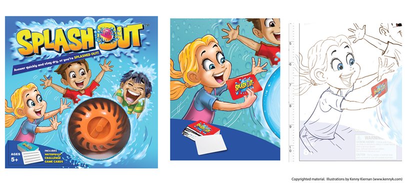
KK: FOT wanted to present it first before going to the finished color, so I added color in photoshop to the existing pencil sketch. At that point it was decided to change the cards to red (good choice considering all the blue on the front panel) and to demonstrate the gameplay a little more clearly by having the girl holding one of the cards, looking down and reading from it out loud. They did a rough edit to the image, then I did my own version of that, which eventually was approved.
The art was OK'd to go to final color, which I created using a combination of Adobe Illustrator and Photoshop. Ultimately some more design elements were added, and here's the final product!
I love how it came out; my wife and kids and I have seen this "out in the wild" multiple times! Another great thing about this project is that it ultimately led to another water-themed Far Out Toys box illustration which was an extension of this brand: "Head Splat!" I'll cover that one in a future ArtWorkPlay with Kenny K post!
PF: It’s funny to see my hack revision on screen next to the final execution. I think the game play and water fun really come through in Kenny's final artwork. And the package really pops at retail. Great teamwork with two wonderfully creative partners!
BC: It was a great project to work on and very satisfying to see it evolve from initial concept, through production art, to impactful package at retail. Paul and Kenny were terrific collaborators throughout this design process and I believe the final packaging really delivered the game and water play in a fun way!
KK: Likewise, it was a pleasure working with both of you gentlemen on this! Thanks very much for the collaboration, and for taking the time to contribute here - see you on the next one!
___________________________
Buy Splash Out™ on Amazon: https://www.amazon.com/Splash-Out-SPL10001-Game-Multicolor/dp/B07B1LHTC7/ref=sr_1_5?crid=57BUTXDTABYG&dchild=1&keywords=splash+out+game&qid=1622992069&sprefix=splash+out%2Caps%2C170&sr=8-5
Paul Fish has most recently been co-founder and Chief Brand Officer at Far Out Toys, the western face of a Chinese toy manufacturer. Before also managing Pablo Pescado Brand Management, a toys, robotics and consumer products consultancy, he was SVP Brand Management at Bandai America, VP of Marketing, Design & International at Spin Master, and SVP of Marketing, Design& Development at Playmates Toys. Paul started his toy career at Mattel, and stayed for 17 years, which included roles as VP & Brand GM of Mattel’s Radio Control business, VP Marketing, Europe in the Netherlands, VP, Entertainment Brands, as well as Director roles in Boys, Nickelodeon and Business Development. Paul is a marketer by discipline, but a designer at heart. He truly loves product, and has a true appreciation for the creative minds and hands of toy designers and inventors that bring ideas to life.
Barry M. Chung has big, giant, huge experience as an art director. He has created award-winning graphic and packaging design for best-selling properties for Warner Bros., Disney, Nickelodeon, DC Entertainment and Fox. He has worked with many toy companies including Mattel, Spin Master, Jaaks Pacific, Maya Group, Far Out Toys, Disney Consumer Products, Playmates, Disney Stores and KidKraft. Id8dsn.com
Kenny Kiernan Illustration & Design Studio specializes in the toy & game and children's market, delivering top-quality work for 20+ years for mega-brands (Hasbro, Mattel, Disney, Marvel, Spin Master, LEGO, Scholastic, more), as well as businesses of all sizes, and creating concept art for inventors and product development. Check out www.kennyk.com for lots of samples of Kenny's work and available services. Connect with Kenny here on POP and onLinkedIn!

Recent Blogs
Press Release
Vango Toys Launches “Anti-Couch Coalition” to Get Kids Outside
The Bloom Report
In Memory of Michael Kohner — A Toy Industry Legend and a True Gentleman of Play

The Bloom Report
Reyn Guyer’s Next 15 Minutes of Fun
The Bloom Report
Boaz Coster Talks Creating Elefun, It's Return, and More!
General
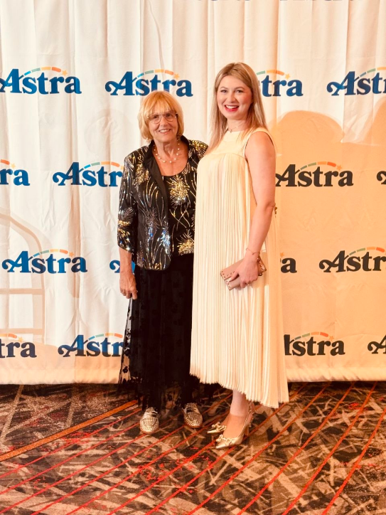
More Than an Exhibition: A Journey of Inspiration and New Friendships at ASTRA
See more
Recent Wiki
BOOK REVIEWS
Book Review: Playful: How Play Shifts Our Thinking, Inspires Connection, and Sparks Creativity by Cas Holman
COMPANIES
New tabletop trading platform

PEOPLE
Jonathan Berkowitz, CEO of PlayMonster, Talks Hacky Sacks, Gen Z Trends, and the Value of Simplicity
COMPANIES
The Association for Games and Puzzles International Announce Speakers and Outstanding Achievement Honoree

COMPANIES
The Bedtime Battle and Why SleepToy is Reimagining Evening Routines
See more
POP's Got Talent

POP Entertainment
Randy Klimpert Shares his Ukulele Collection
POP Entertainment
Steve Casino Peanut Art
POP Entertainment
Everyone's Talking about POP!
POP Entertainment
Princess Etch - a Multi-Talented Etch A Sketch Artist
POP Entertainment
Joseph Herscher of Joseph' s Machines.
See more
Recent POPcast

Hidden Role: The Brains Behind your Favorite Games
Brent Bushnell talks Two Bit Circus, VR, & STEAM (Part 1)
Hidden Role: The Brains Behind your Favorite Games
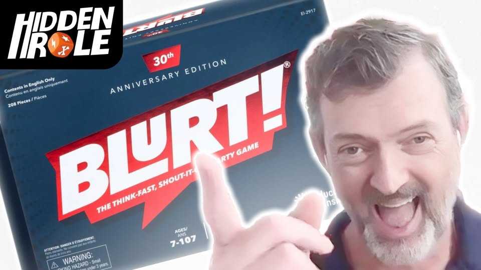
Tim Walsh Celebrates the 30th Anniversary of Blurt!
Hidden Role: The Brains Behind your Favorite Games
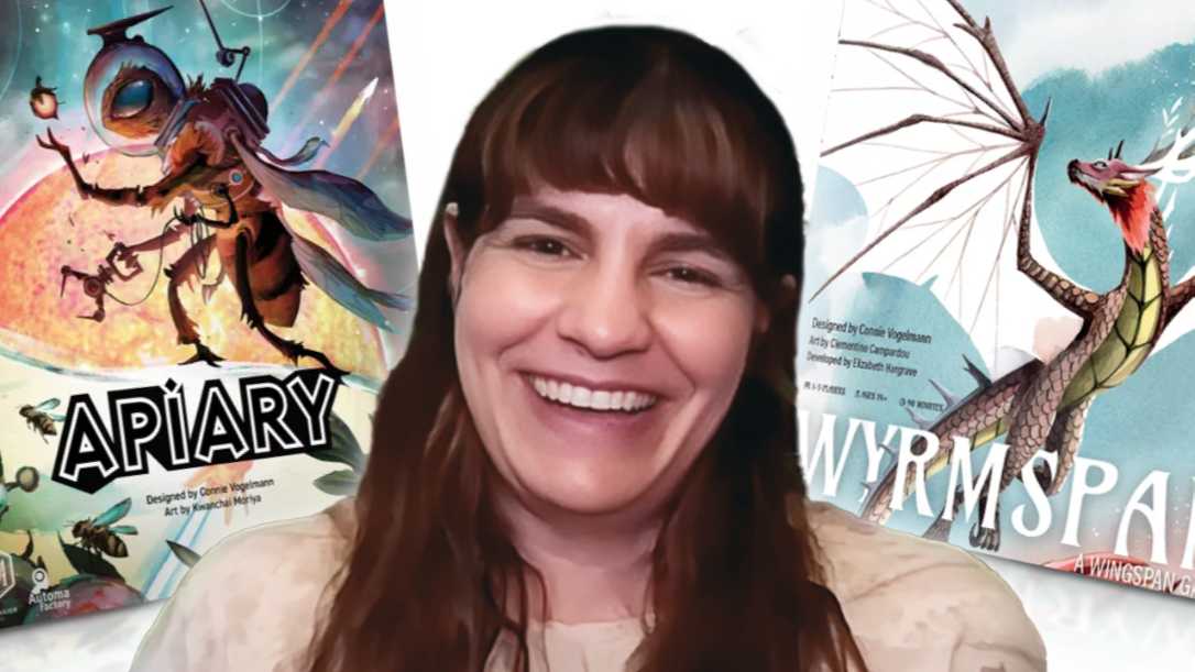
Connie Vogelmann designed Apiary & Wyrmspan!
Hidden Role: The Brains Behind your Favorite Games
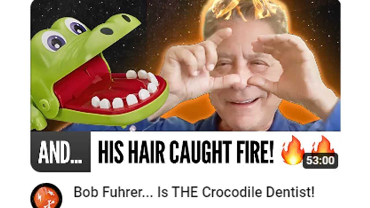
Bob Fuhrer... Is THE Crocodile Dentist!

Hidden Role: The Brains Behind your Favorite Games
Tom Dusenberry... Bought Atari, Wizards of the Coast, and Avalon Hill!
See more
POPDuos
POPDuos: Interviews with Legends and Leaders
POPDuo: Richard Dickson, Mattel’s President & COO, and Kedar Narayan, Young Inventor Challenge AMB

POPDuos: Interviews with Legends and Leaders
POPDuo: Will Shortz and Josh Wardle

POPDuos: Legends and Leaders Explore Creativity
POP Duo: Elan Lee, Co-Founder, Exploding Kittens.and Jeff Probst, Host and Exec Producer, Survivor
POPDuos: Legends and Leaders Explore Creativity
POP Duo: David Fuhrer, MNG Director, Blue Sq Innovations & Shawn Green, past Dodgers & Mets MLB Star

POPDuos: Legends and Leaders Explore Creativity
POP Duo: Bob Fuhrer, Founder, Nextoy and Tom Fazio, Golf Course Designer
See more
Featured Articles
The Bloom Report
Toy Inventors--The Heart and Soul of the Industry
The Bloom Report
Brian Turtle: 'Endless' Stories, Advice, Kevin Bacon and More! tBR Person of the Week
Biographies and Interviews
Jonathan Levy on Jon2.0 - from Co-Founding Mastermind Toys to Spin Master
Biographies and Interviews
Andrew Perlmutter's Journey from Glencoe to Funko with Crazy Ideas that turned out Golden
See more