JOE CAMPOS: UNLEASHING THE RAW POWER OF WWE: A MCHALE DESIGN CASE STUDY
by McHale Design | 14 Jun 2024
Product Launches

When our friends at Mattel tasked McHale Design to take on the project of creating branding, new packaging, and style guide for WWE’s 2024 action figure line, we enthusiastically embraced the challenge! Our mission? To capture WWE’s electrifying energy and deliver it to fans of all ages.
The Arena Lights Up: Rebranding a Visual Powerbomb
Picture the scene: spotlights blazing, adrenaline rushing, and the crowd roaring. Our approach to WWE branding went beyond packaging; it was about crafting a thrilling, immersive experience for the consumer.
Our research phase began by analyzing WWE’s visual history, previous brand iterations, dynamic video graphics, and promotional campaigns. We wanted to create a brand refresh that would generate excitement for WWE’s newest roster of superstars while also capitalizing on the established popularity of WWE legends.
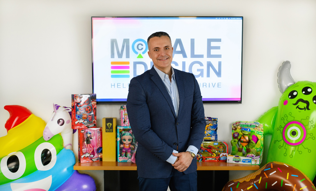
“Having someone on our team who previously worked on the WWE brand and is a real fan was critical in understanding the nuances of WWE,” says Joe Campos, president of McHale Design.
Successful brand design for consumer goods necessitates a strategic approach. The coordination of brand elements on final packaging is pivotal. Patterns, textures, and backgrounds should be developed with their final intended use in mind. Additionally, the key art and trade dress layout must be visualized and sketched out to ensure optimal communication hierarchy.
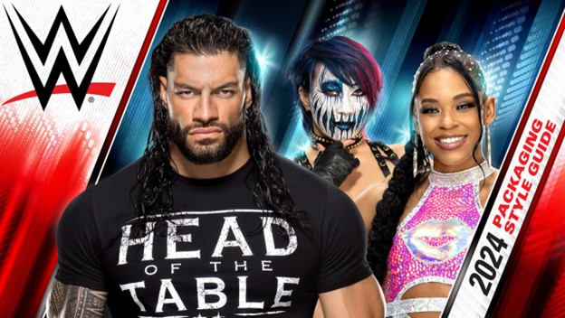
Inspired by WWE telecasts and Superstar costuming, we developed a color palette centered on primary colors that integrated techy textures, flashy light patterns, and backgrounds with layered depth.
Bold, angled graphic elements symbolized the electric action of the ring. The provided Superstar photo assets were enhanced to create Key Art that reflected unbound energy and unified all the wrestlers under the WWE brand.
Building Up The Packaging Hierarchy of a Brand
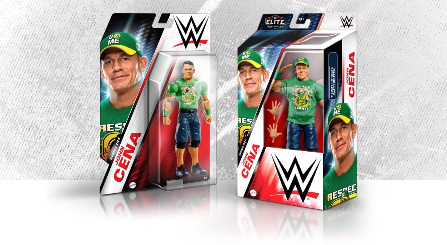
To reinforce the WWE branding mantra that “The Superstars are the Stars,” the visual hierarchy on this packaging design needed to reflect this concept. From the beginning, Mattel stressed the importance of making the Superstars’ image and their name the first read, even more so than the WWE logo.
According to Art Director Mike Hass, Mattel observed an interesting consumer behavior: “when shoppers see packages hanging on a rack, they tend to tilt each one to reveal the face and name until they find the Superstar they’re looking for. To accommodate this behavior, it was crucial to prominently display the Superstar’s image and name on the left side of the packaging. This way, potential consumers could easily spot their favorite Superstar.”
The names and faces of John Cena, The Rock, and The Undertaker are instantly recognizable to fans, even young children who can’t yet read. The WWE logo follows, verifying the product’s authenticity. Subsequently, highlighted feature callouts and secondary segmentation logos such as “The Elite Collection” enhance the product's perceived value and collectability.
Expanding the Brand: Style Guide Ready for the Spotlight!
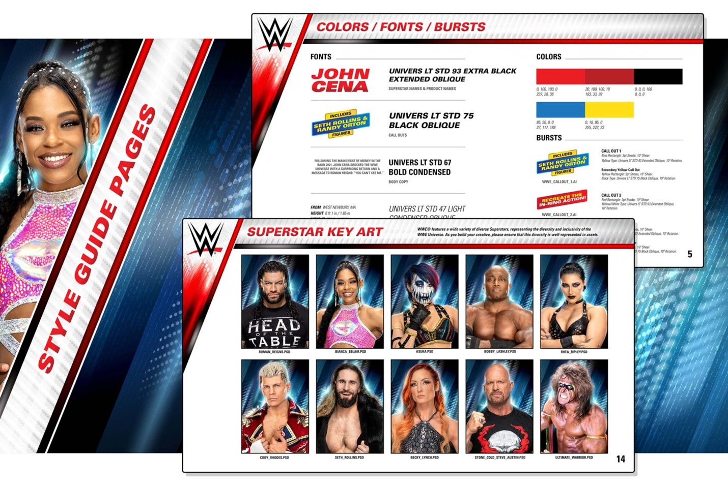
Although we developed a versatile brand identity that dominated across various packaging types, a successful Style Guide had to ensure the branding would easily adapt to every need of the licensor.
Mike Hass said, “the biggest challenge was to create modular design elements that weren’t restricted to specific areas. For packaging, we placed the Superstar Key Art on the left side, while the WWE logo was positioned on the right. This arrangement accommodated the consumers’ habit of scanning through packaging. However, the Style Guide elements needed to be adaptable for various purposes, including ad templates, product applications, and retail merchandising.”
From the color palette to the design elements, we ensured every brand detail complemented each other and was crafted to function effectively where needed.
Joe Campos added, “Final files should ensure style guide elements are easy to find and use, allowing licensors to retrieve and apply necessary fonts and graphics intuitively.” A successful style guide needs logical organization and a clean file structure. Intuitive visual mock-ups help licensees understand how to consistently apply the branding. Brand guidelines should be written to ensure all elements are used correctly to maintain brand consistency.
The collaborative effort between McHale Design and Mattel has yielded a packaging and branding strategy that electrifies and captivates WWE fans, much like the Superstars themselves. By meticulously integrating dynamic visuals and thoughtful design elements, we crafted a style guide that reflects WWE's high-octane spirit, setting the foundation for consistency and adaptability across all platforms.
This comprehensive approach invites fans of all ages to experience the excitement of the WWE from the moment they watch the content until the moment they see the packaging. The lessons learned and the innovative strategies developed in this project will continue to influence and inspire, ensuring that WWE's brand remains as legendary and powerful as its Superstars!

Recent Blogs
Reviews
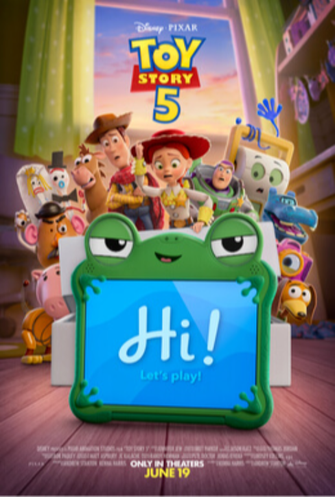
Film Review: Toy Story 5

Reviews
Film Review: Free to Play

The Bloom Report
Howard “Quiggly” Chang Talks Designing Teenage Mutant Ninja Turtles Toys, Ancientz and more!
Press Release
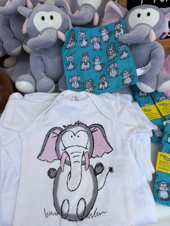
Two Small Businesses, One Big Leap of Faith: Baby Paper and Paper Cow Join Forces on a New Collaboration
The Bloom Report
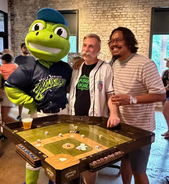
Former LEGO Master Designer Launches Unplugged Arcade
See more
Recent Wiki
BOOK REVIEWS
Film Review: Toy Story 5
BOOK REVIEWS
Film Review: Free to Play
PEOPLE
Howard “Quiggly” Chang Talks Designing Teenage Mutant Ninja Turtles Toys, Ancientz and more!
COMPANIES
Two Small Businesses, One Big Leap of Faith: Baby Paper and Paper Cow Join Forces on a New Collaboration

MISCELLANEOUS
Former LEGO Master Designer Launches Unplugged Arcade
See more
POP's Got Talent

POP Entertainment
Randy Klimpert Shares his Ukulele Collection
POP Entertainment
Steve Casino Peanut Art
POP Entertainment
Everyone's Talking about POP!
POP Entertainment
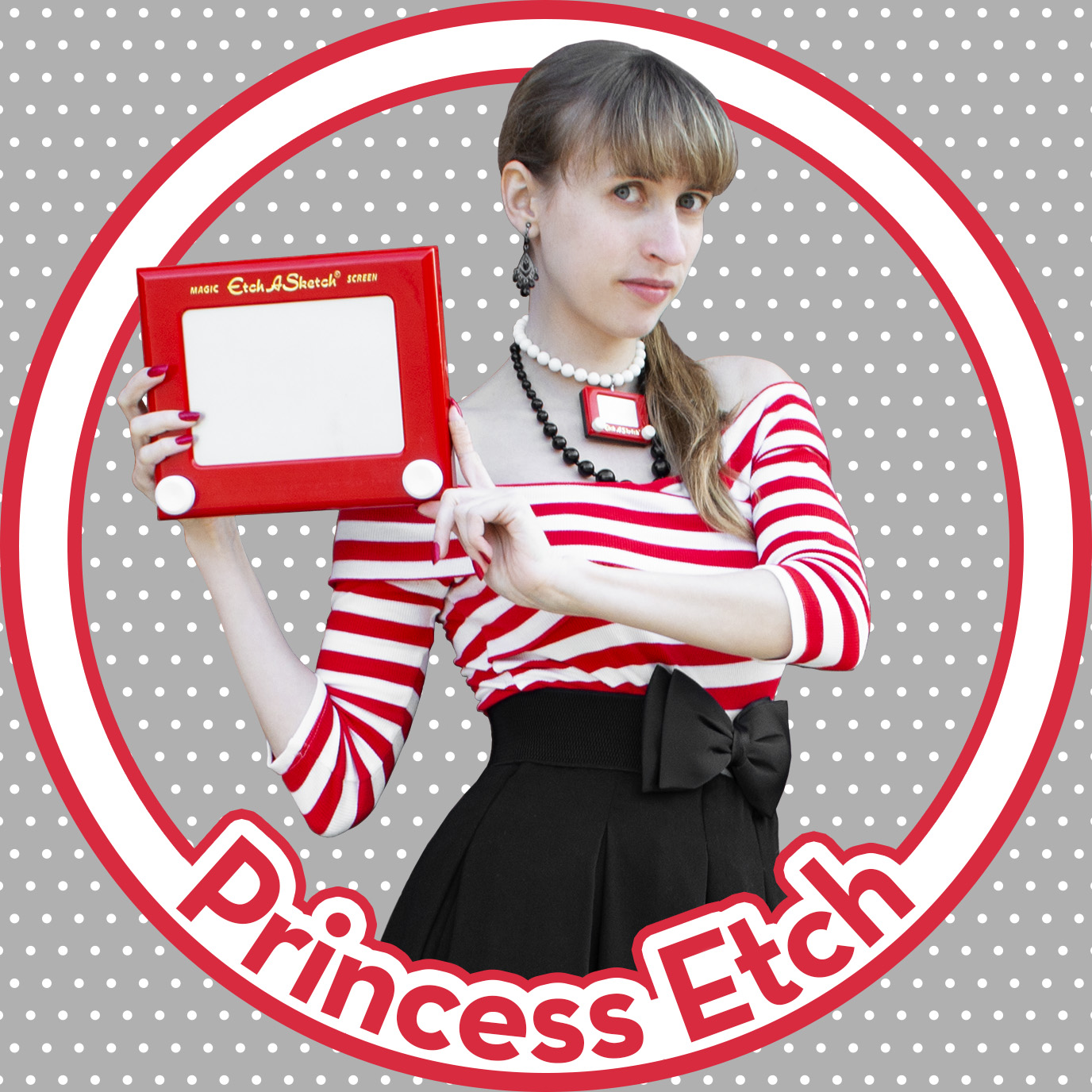
Princess Etch - a Multi-Talented Etch A Sketch Artist

POP Entertainment
Joseph Herscher of Joseph' s Machines.
See more
Recent POPcast

Hidden Role: The Brains Behind your Favorite Games
Brent Bushnell talks Two Bit Circus, VR, & STEAM (Part 1)
Hidden Role: The Brains Behind your Favorite Games
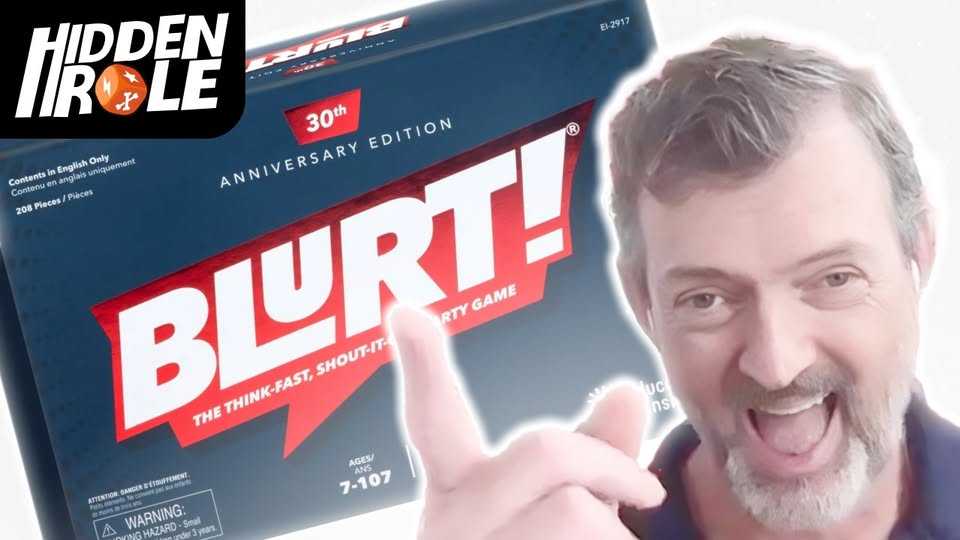
Tim Walsh Celebrates the 30th Anniversary of Blurt!
Hidden Role: The Brains Behind your Favorite Games
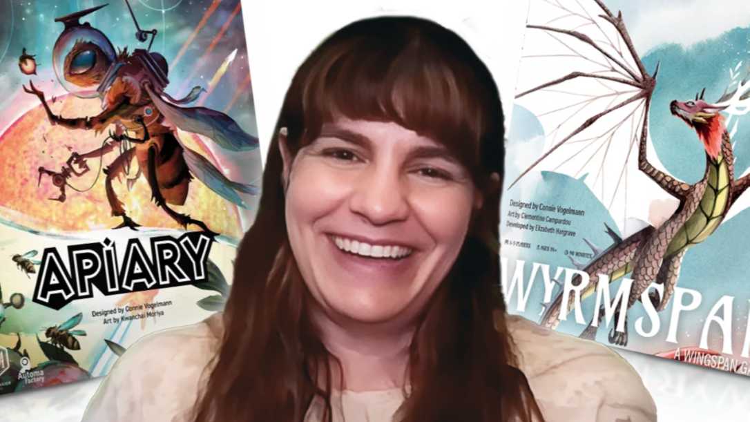
Connie Vogelmann designed Apiary & Wyrmspan!
Hidden Role: The Brains Behind your Favorite Games
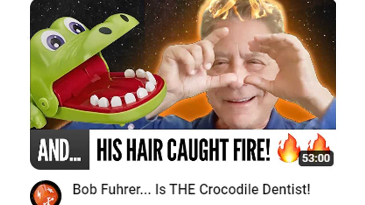
Bob Fuhrer... Is THE Crocodile Dentist!

Hidden Role: The Brains Behind your Favorite Games
Tom Dusenberry... Bought Atari, Wizards of the Coast, and Avalon Hill!
See more
POPDuos

POPDuos: Interviews with Legends and Leaders
POPDuo: Richard Dickson, Mattel’s President & COO, and Kedar Narayan, Young Inventor Challenge AMB

POPDuos: Interviews with Legends and Leaders
POPDuo: Will Shortz and Josh Wardle

POPDuos: Legends and Leaders Explore Creativity
POP Duo: Elan Lee, Co-Founder, Exploding Kittens.and Jeff Probst, Host and Exec Producer, Survivor
POPDuos: Legends and Leaders Explore Creativity
POP Duo: David Fuhrer, MNG Director, Blue Sq Innovations & Shawn Green, past Dodgers & Mets MLB Star

POPDuos: Legends and Leaders Explore Creativity
POP Duo: Bob Fuhrer, Founder, Nextoy and Tom Fazio, Golf Course Designer
See more
Featured Articles
The Bloom Report
Toy Inventors--The Heart and Soul of the Industry
The Bloom Report
Brian Turtle: 'Endless' Stories, Advice, Kevin Bacon and More! tBR Person of the Week
Biographies and Interviews
Jonathan Levy on Jon2.0 - from Co-Founding Mastermind Toys to Spin Master
Biographies and Interviews
Andrew Perlmutter's Journey from Glencoe to Funko with Crazy Ideas that turned out Golden
See more