
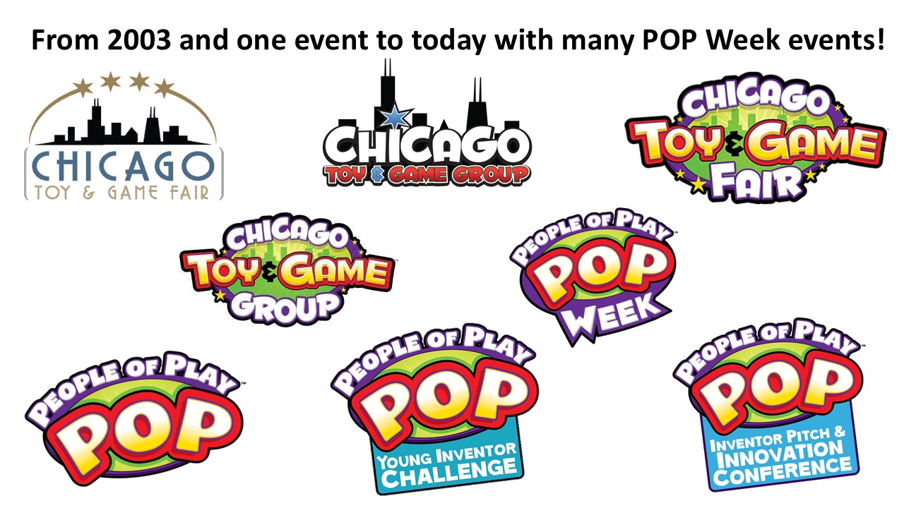
Hey Matt! It was great seeing you at the NY Toy Fair last month! I’m sure you noticed that signage for both POP and the CHITAG Fair was everywhere. We received a ton of positive feedback on how smoothly we transitioned our brand from the Chicago Toy & Game Group to People of Play. The logos were so visually aligned that people immediately recognized them as part of the same family.
The POP logo and name have been incredibly well received—people love them! We’ve decided to retain the CHITAG Fair logo for our consumer-facing events, since it’s more challenging to build familiarity with new branding among general audiences. It couldn’t feel more right.
What’s also great is how easily both logos adapt to highlight specific events or initiatives—adding banners or extensions is seamless.
Would you be open to walking us through your creative process—starting with our original logo and then the evolution to the POP branding? We’d love to highlight the design journey and your role in it.
- Simplicity and Bold Geometry: The mark was built using strong, clean forms that read clearly at any size, from social icons to large-format signage. The bold, rounded shapes nod to the playfulness inherent in the brand, while still feeling professional and versatile. The large bubble-letter "POP" forms visually burst from the center, echoing the excitement and energy of play. The curvature and layered outlines also lend themselves well to product applications and sub-brand extensions.
- Scalability and Versatility: A great logo needs to work across a huge range of applications, digital, print, product packaging, motion graphics, and event signage. We engineered the POP logo to hold up in one color or full color, and to be recognizable in both large-scale and micro-format. That flexibility has made it easy to roll out across platforms. The clarity of the outlined letterforms and central placement of the text ensures readability, even when scaled down.
- Typography with Personality: The custom typography strikes a balance between fun and legibility. It has just enough character to feel playful without veering into cartoonish. The energetic, slightly tilted “PEOPLE OF PLAY” lettering arcs above the main logo like a banner, adding dynamism and movement. The rhythm and spacing were carefully calibrated to ensure the logo could sit comfortably with a wide range of taglines, sub-brands, or event banners.
- Color Strategy: We used color intentionally—not just to stand out, but to create a system. The POP palette is vibrant, inviting, and adaptable, with enough contrast to work in multiple environments. The gradient yellow-to-white fills, paired with red, purple, and green framing, give the logo an uplifting and vibrant personality. Importantly, it complements the original CHITAG colors, making the visual transition smoother and more intuitive for long-time followers.
- System Thinking: POP wasn’t just a logo—it was a design system. We built it to act as the umbrella for CHITAG Fair, POP Week, educational programming, industry awards, and more. That meant developing guidelines and flexible templates to support future growth without constant reinvention. The graphic energy of the logo lends itself to merchandising, signage, social media assets, and beyond—all while keeping a consistent and recognizable core.

Recent Blogs
The Bloom Report
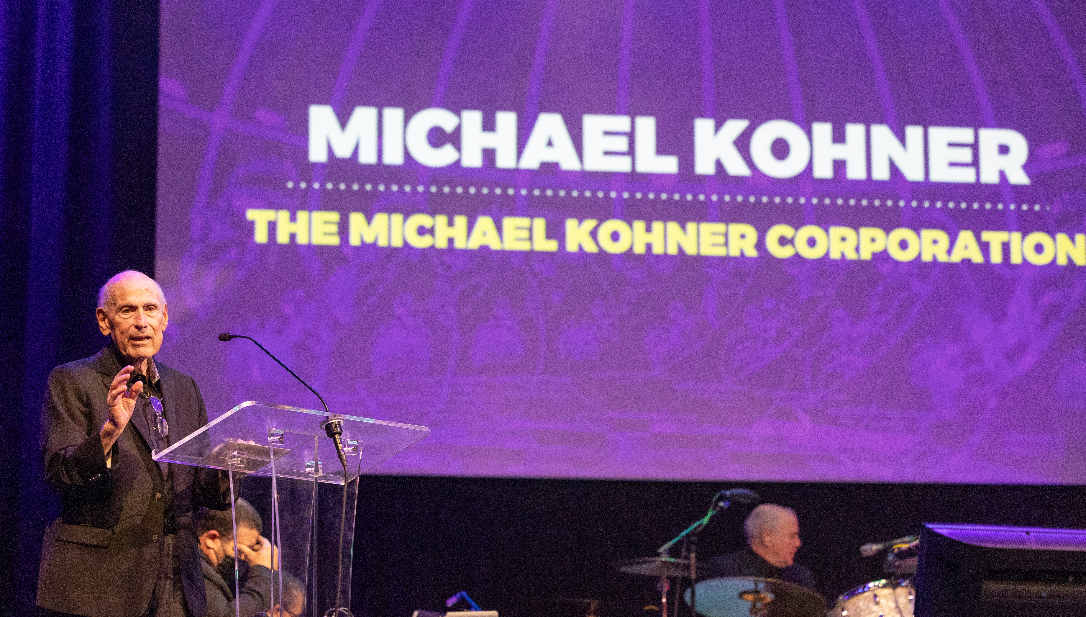
In Memory of Michael Kohner — A Toy Industry Legend and a True Gentleman of Play

The Bloom Report
Reyn Guyer’s Next 15 Minutes of Fun
The Bloom Report
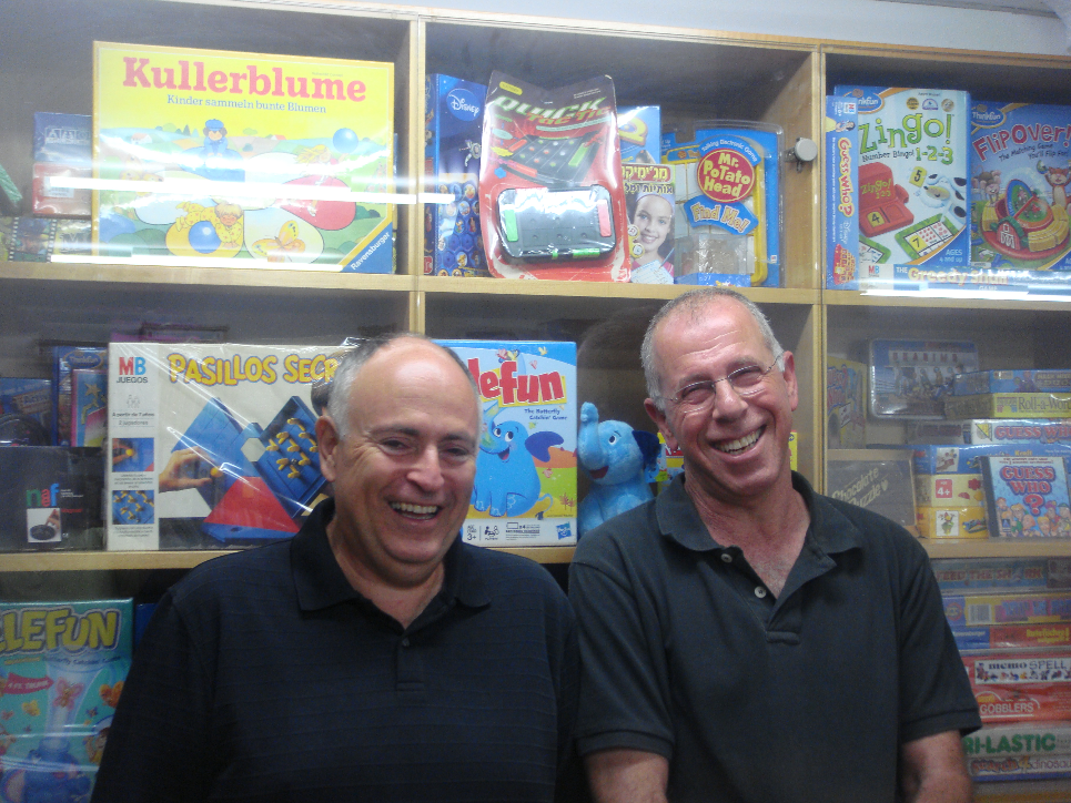
Boaz Coster Talks Creating Elefun, It's Return, and More!
General
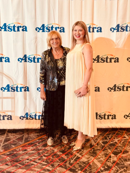
More Than an Exhibition: A Journey of Inspiration and New Friendships at ASTRA
Press Release
Sari Wiaz, Baby Paper - The Story No One is Covering..How are small brands surviving?
See more
Recent Wiki
BOOK REVIEWS
Book Review: Playful: How Play Shifts Our Thinking, Inspires Connection, and Sparks Creativity by Cas Holman
COMPANIES
New tabletop trading platform

PEOPLE
Jonathan Berkowitz, CEO of PlayMonster, Talks Hacky Sacks, Gen Z Trends, and the Value of Simplicity
COMPANIES
The Association for Games and Puzzles International Announce Speakers and Outstanding Achievement Honoree
COMPANIES
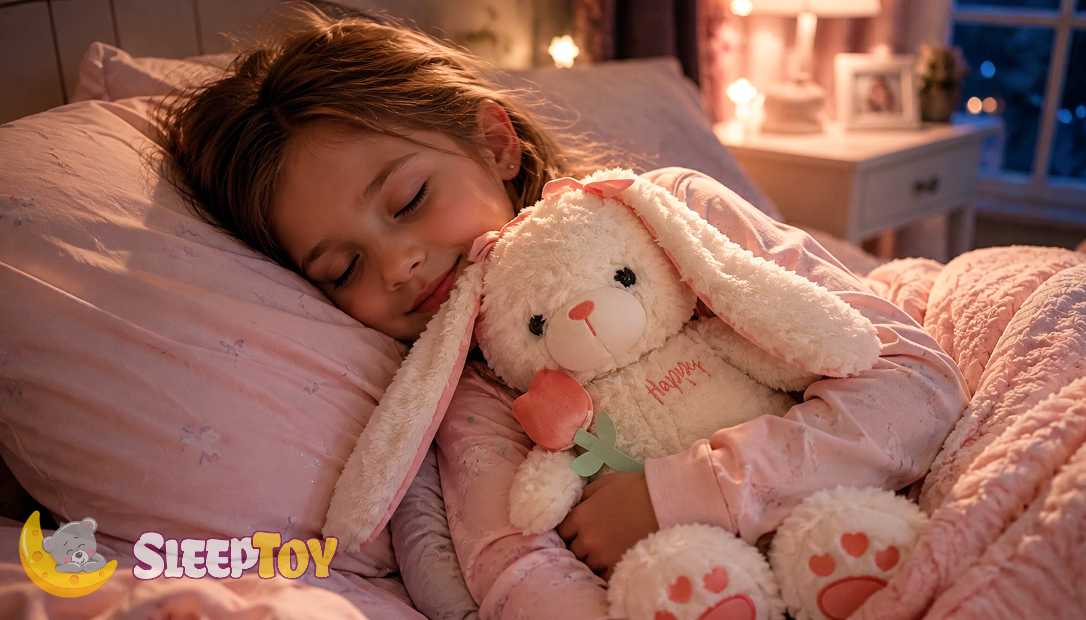
The Bedtime Battle and Why SleepToy is Reimagining Evening Routines
See more
POP's Got Talent

POP Entertainment
Randy Klimpert Shares his Ukulele Collection
POP Entertainment
Steve Casino Peanut Art
POP Entertainment
Everyone's Talking about POP!
POP Entertainment
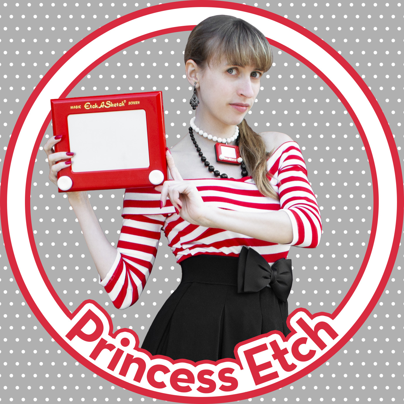
Princess Etch - a Multi-Talented Etch A Sketch Artist
POP Entertainment
Joseph Herscher of Joseph' s Machines.
See more
Recent POPcast

Hidden Role: The Brains Behind your Favorite Games
Brent Bushnell talks Two Bit Circus, VR, & STEAM (Part 1)
Hidden Role: The Brains Behind your Favorite Games
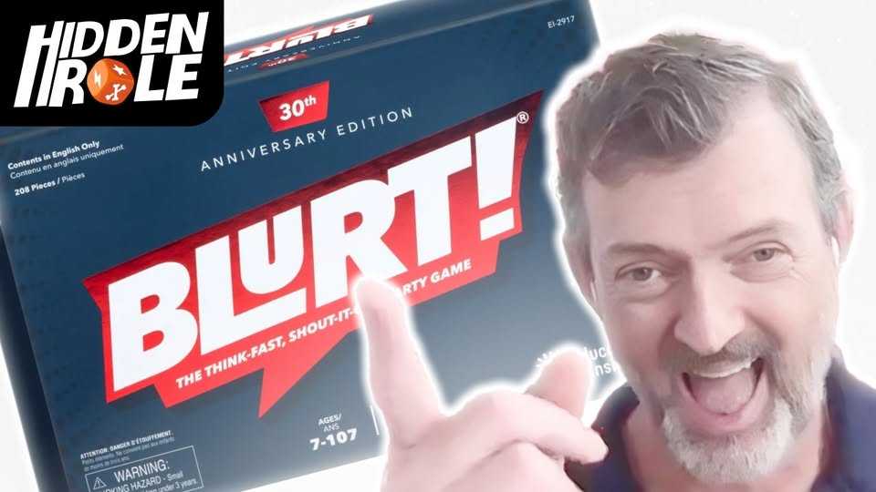
Tim Walsh Celebrates the 30th Anniversary of Blurt!
Hidden Role: The Brains Behind your Favorite Games
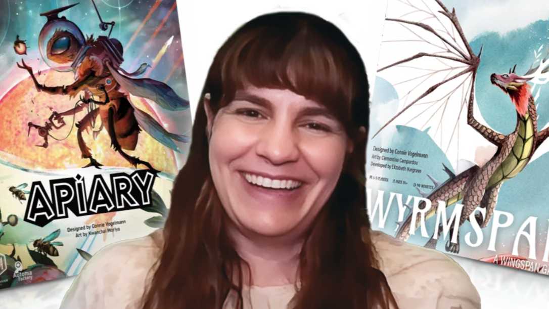
Connie Vogelmann designed Apiary & Wyrmspan!
Hidden Role: The Brains Behind your Favorite Games
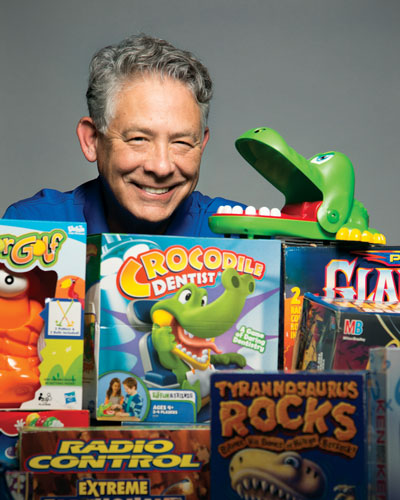
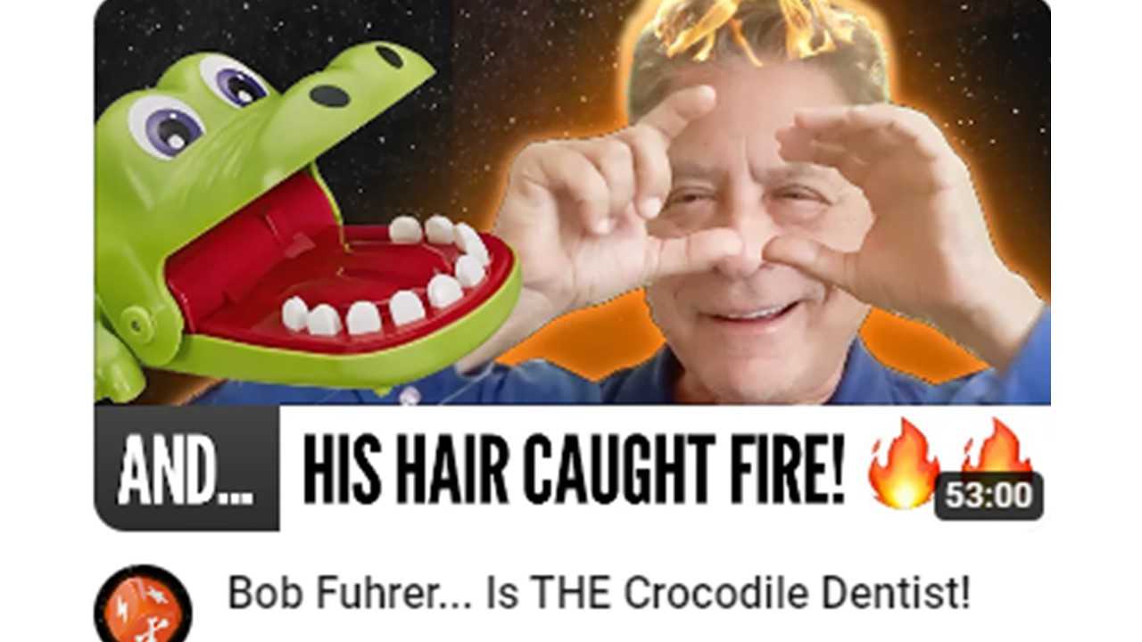
Bob Fuhrer... Is THE Crocodile Dentist!
Hidden Role: The Brains Behind your Favorite Games
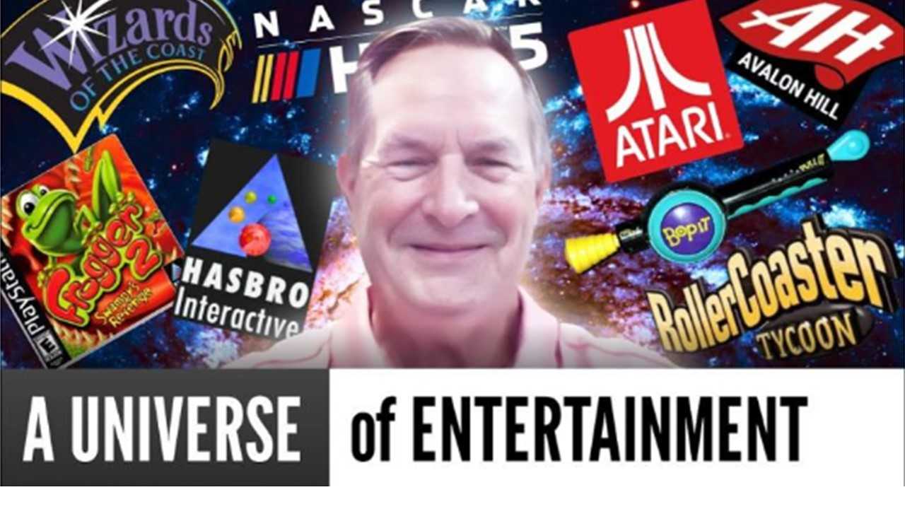
Tom Dusenberry... Bought Atari, Wizards of the Coast, and Avalon Hill!
See more
POPDuos
POPDuos: Interviews with Legends and Leaders
POPDuo: Richard Dickson, Mattel’s President & COO, and Kedar Narayan, Young Inventor Challenge AMB

POPDuos: Interviews with Legends and Leaders
POPDuo: Will Shortz and Josh Wardle

POPDuos: Legends and Leaders Explore Creativity
POP Duo: Elan Lee, Co-Founder, Exploding Kittens.and Jeff Probst, Host and Exec Producer, Survivor
POPDuos: Legends and Leaders Explore Creativity
POP Duo: David Fuhrer, MNG Director, Blue Sq Innovations & Shawn Green, past Dodgers & Mets MLB Star

POPDuos: Legends and Leaders Explore Creativity
POP Duo: Bob Fuhrer, Founder, Nextoy and Tom Fazio, Golf Course Designer
See more
Featured Articles
The Bloom Report
Toy Inventors--The Heart and Soul of the Industry
The Bloom Report
Brian Turtle: 'Endless' Stories, Advice, Kevin Bacon and More! tBR Person of the Week
Biographies and Interviews
Jonathan Levy on Jon2.0 - from Co-Founding Mastermind Toys to Spin Master
Biographies and Interviews
Andrew Perlmutter's Journey from Glencoe to Funko with Crazy Ideas that turned out Golden
See more